Design 1
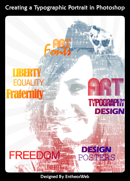
This magazine cover explores the impact of our state on color perception. The photo is vividly rendered, while the title remains eye-catching due to the color contrast between the background and the title itself. The layout is not only easy to read but also engaging.
Design 2
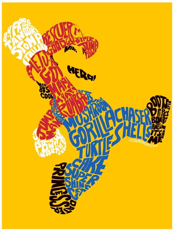
I like this shape. It is made with the shape of Super Mario. It makes the picture more vivid and creative.
Design 3
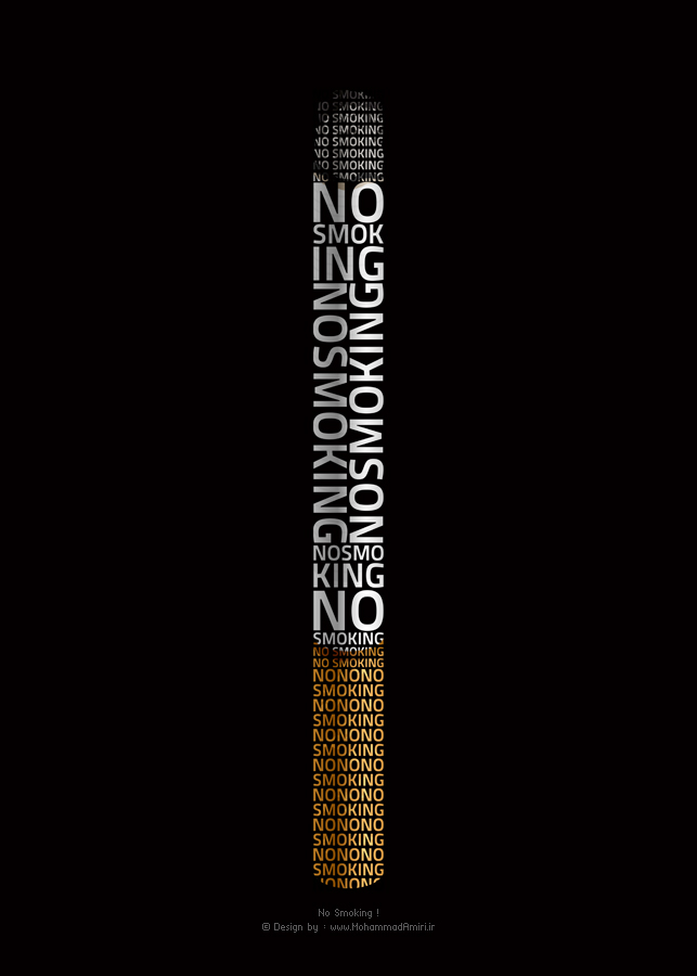
With this picture, he wanted to express that smoking is harmful to health and tell us to smoke as little as possible. Long-term smoking is not good for our health.
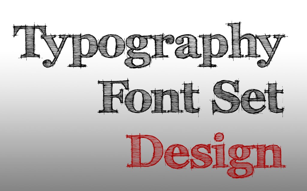
Design 4
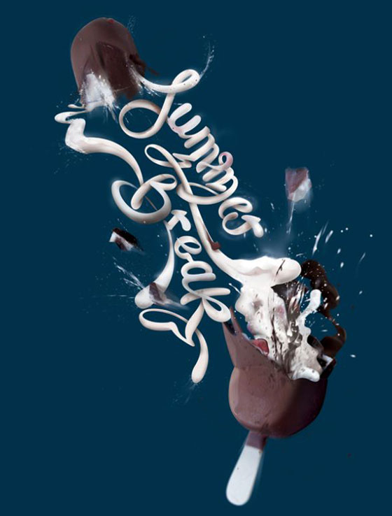
What’s interesting about this image is that it’s filled with unique fonts, and its twisted fonts and simple colors will grab your attention.
Design 5

These typography are made up of the letters of the word. You can recognize the meaning just by seeing the words.
