By Cheung Siu Wah
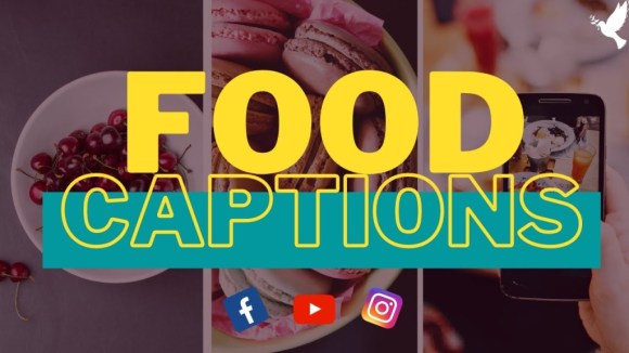
I love the font “FOOD” with full color, while “CAPTION” is in outlined design. It creates more fun and outstanding feel to readers.
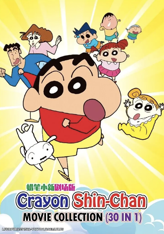
The Main font “Crayon Shin-Chan”, it contains a stroke on the outer border of the words. The round edge looks like cute and relevant to the cartoon theme of this poster.
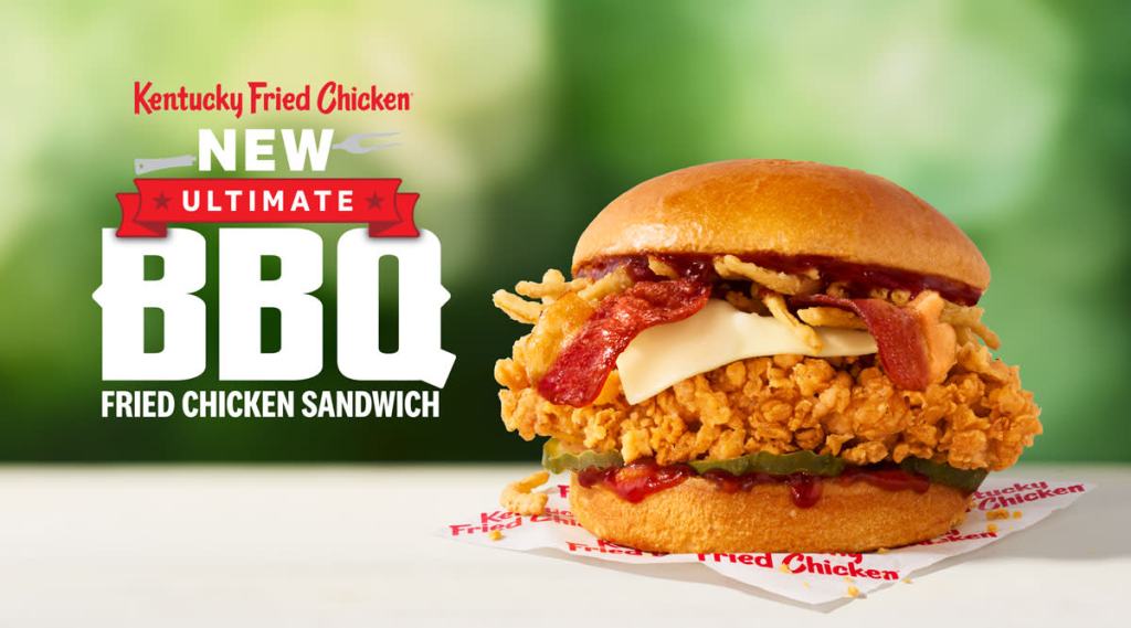
Here involves 3-4 font, the placement of each font create a harmonious design. The Uppercase fonts emphasis important message that this product is “NEW” and ask for customer eagerly to give it a try, as it is “ultimate BBQ” favour. Moreover, the B and Q of BBQ has a triangle stick to the edge, it create a feeling of fun image and happiness.
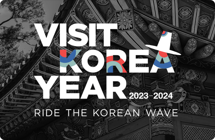
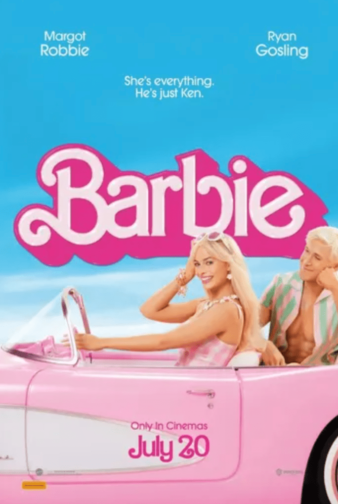
You can see the word Visit and Year are set in parallel position, while KOREA stands out, with extra add-on design on it. Blue and red is part of the color of Korea national flag, this can let readers read faster and correlated to Korea.