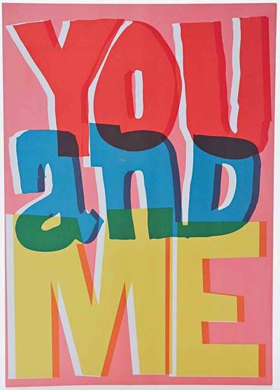
letters as pictures
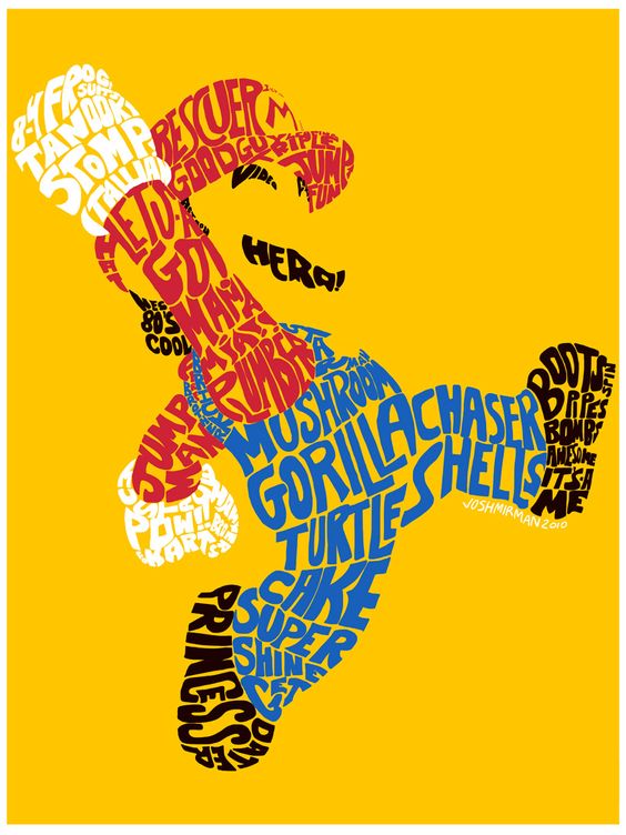
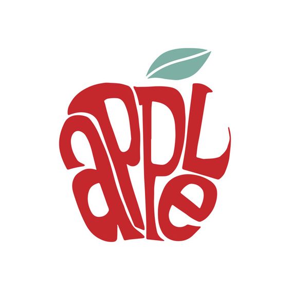

These typography is formed by the letters of the words. You can recognize what is about as soon as you see this typography, even you don’t read word. Choosing color is very important for that.
Dull colors
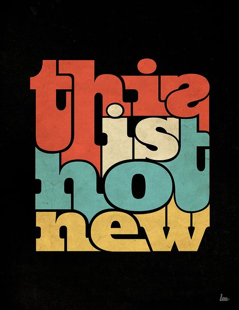
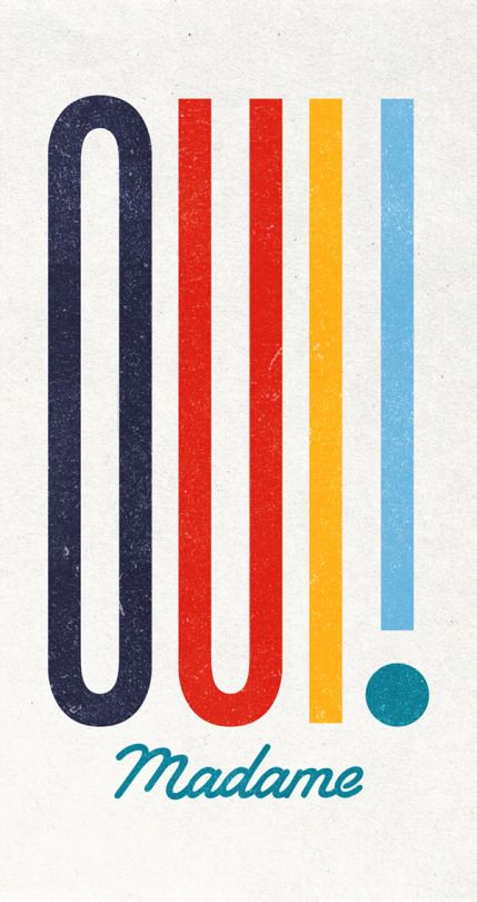
These typography are colorful but it is not flashy because they are used dull color. That would remind you of America n design in the 70’s
Others
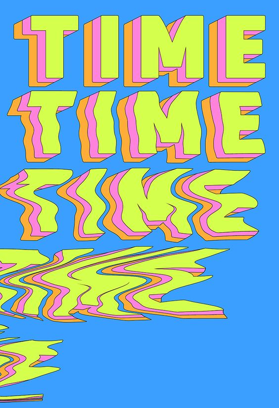
The reason my eyes was chaught by this typography is that it shows time flies and delivers we have to spend time wisely.
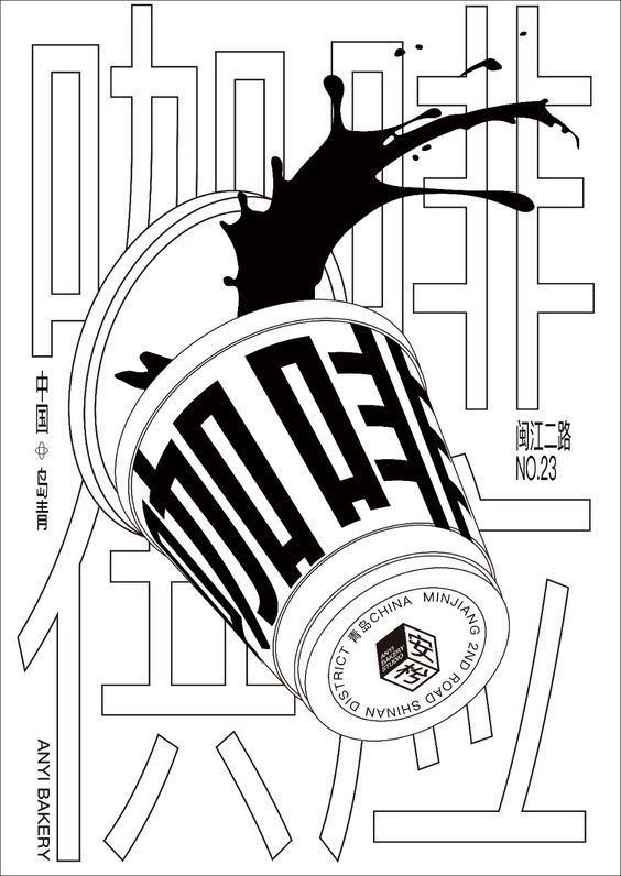
This typography uses only black and white but it is very easy for the audience to guess what it means.
