Nanako A0102
B A S K I N • R O B B I N S
This is the typography of Baskin-Robbins, an ice cream shop. The message that you can enjoy a different flavor every day for one month (31 days) is contained in the BR logo.
Depending on how you look at this logo, the 31 letters can be seen more clearly than the store name, Baskin-Robbins, making it easier for customers to receive the message. In fact, in Japan, many people call this store “thirty-one”, not Baskin-Robbins.
W A L T D I S N E Y
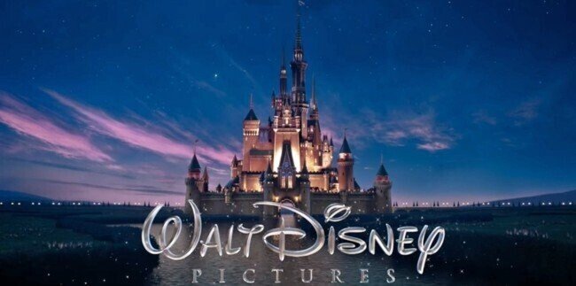
This is the logo that plays before a Walt Disney movie begins. Just looking at this logo evokes the fantasy and excitement of Disney movies.
It doesn’t stop at the movie, it feels like you’re stepping into a Disney theme park, and these scenes and logos give you the feeling of being immersed in the movie, and I feel it has an impact.
D E A T H N O T E
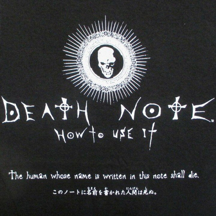
This is typography from the anime Death Note. This is an anime with a terrifying setting in which the person whose name is written on the note will die, and this typography conveys the eerie atmosphere of the anime.
Also, in the anime, there is a language that only God of Death can read, and the strange font that looks like the characters matches the story.
Attack on Titan

This is the title typography for the anime Attack on Titan. The blood spatter and wounds caused by the sword when slashing the titan that appears in the anime are expressed in the font, and the heavy atmosphere of the anime is expressed in this typography.
PoKeMoN GO
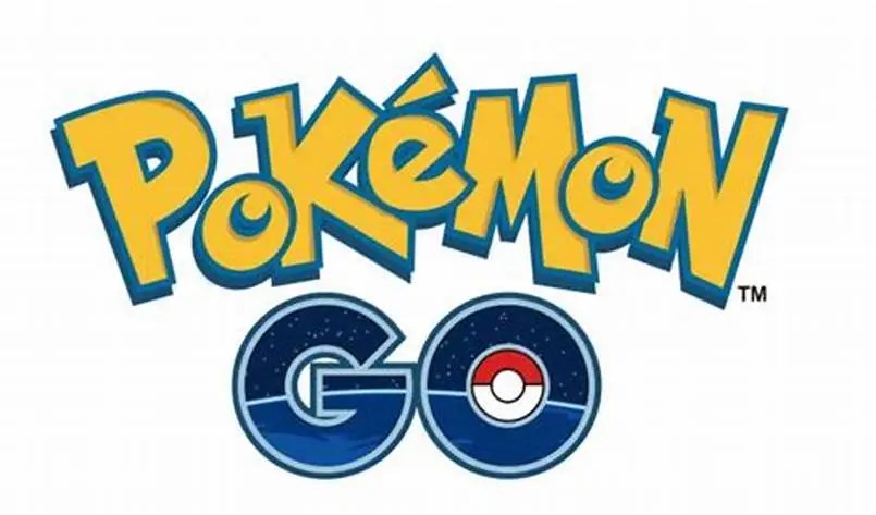
This is the logo for the smartphone app called Pokemon GO. This app is a game that uses AR technology to find Pokemon in a real town.
The GO logo features illustrations depicting space and the earth, and the vision of Pokemon GO is to “create an opportunity for people to explore the real world together and discover its charm.” The design conveys the message.
