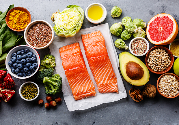
Today’s urbanites are looking for a healthy diet. When you see more eye-catching pictures. This will attracting your attention and apply effects like gradients, shadows, or outlines to make the typography stand out.
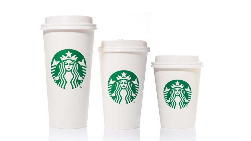
These green color queen head logo and paper cup for its branding, including typography. Which is easy to reminiscent cup of coffee in the morning
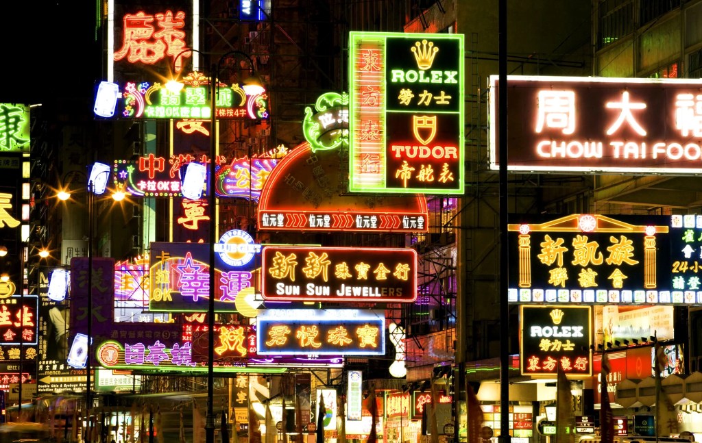
The Neon lights of Hong Kong at night in the 1980s are fully reflect the colouful life of Hong Kong’s colouful night-time life. If is also because of this that Hong Kong is known as the Pearl of Orient.
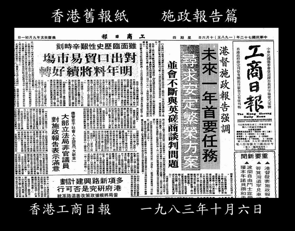
Headlines and subheadings were often set in bold typefaces to grab the reader’s attention. Many old newspapers used narrow columns for text, which allowed for more efficient use of space on the printed page. Old newspapers were primarily printed in black and white, with color used sparingly, usually for special sections or advertisements.
This typs of typography uses only black and white, it clean and very easy for the reader to understand the meaning.
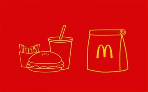
When you see the French fries and hamburger logo, you will naturally think of a fast food restaurant name that everyone from babies to the elderly will recongnize.
