A0019 (Sin Ting Wong, Cindy)
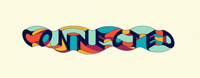
(CONNECTED IDENTITY – COLOUR 2
CLIENT: INFIELD FESTIVAL
PROJECT: FESTIVAL IDENTITY
INFO: Typographic/illustrated identity created for a US festival, with a focus on horse racing, in addition to bands & beer.)
The word is showing its meaning with its connection of the letters. It used many saturated colors blocks together but the navy blue of the words C-O-N-N-E-C-T-E-D makes it readable.
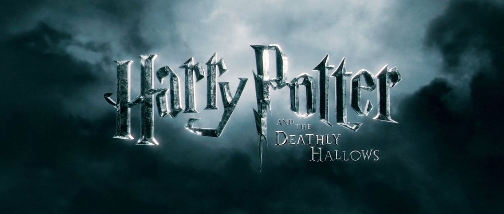
One of my favorite movie, Harry Potter. It created a very unique typography to present the excitement, horror, magics of the Wizarding World, and the main elements of the movie, Harry’s forehead lightning bolt.
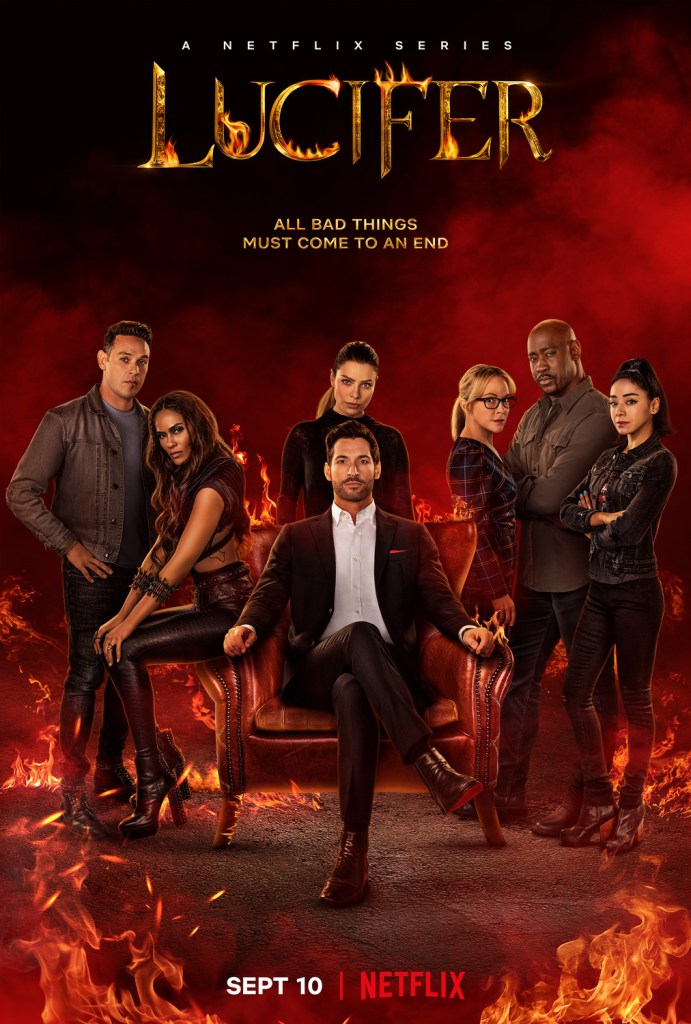
Another Netflix show I like is LUCIFER. The font of its show name is metallic, surrounded by fire and sharp edges. It definitely matches the topic of the show: devil and hell.
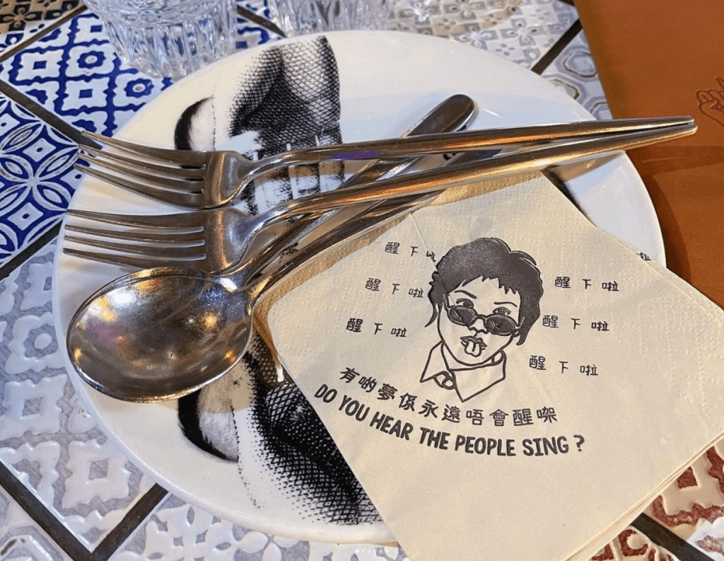
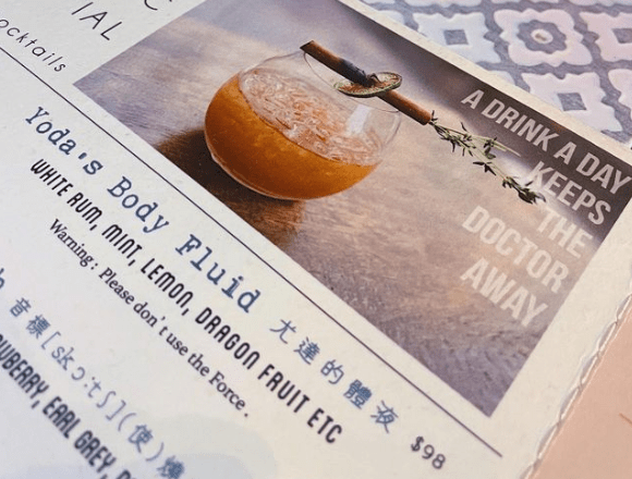
(Napkin and menu of mamaday, a youth cafe full of hilarious and fun designs in Hong Kong)
Both traditional Chinese words and English quote on the napkin are like handwritten which are not appear on napkin normally. It create a contrast and feeling that the restaurant is more than dinning. It is a place for fun!
The fonts on menu look a bit vintage. These are good choice of fonts to match its funky names of the dishes. Reading the fonts and layouts on the menu is like observing an art piece.
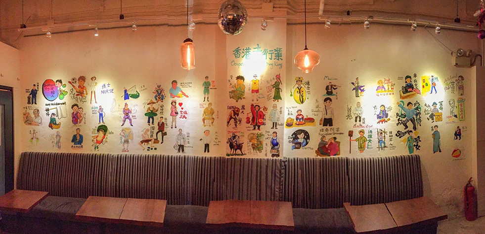
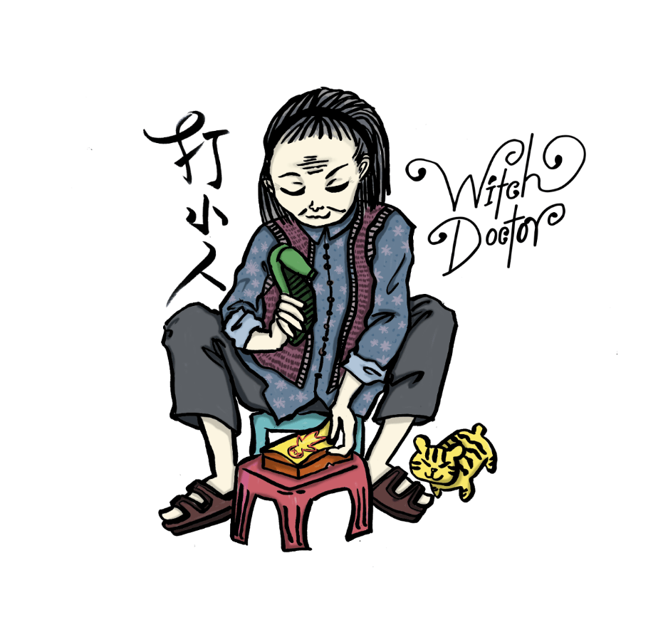
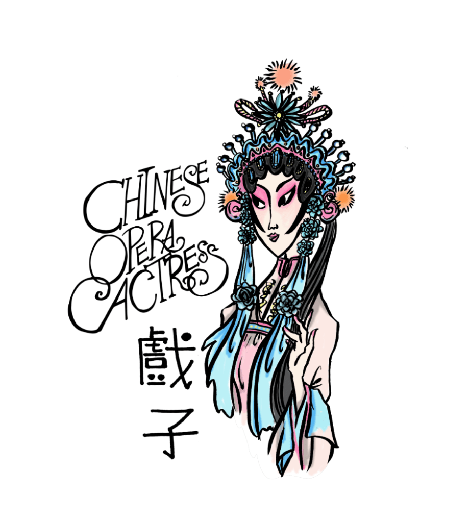
(Wall painting project of “Occupations of our old Hong Kong”)
It used a lot of curves to exaugurated the name of the occupations. Black thin links aligned its sketching styles of the characters’ paintings too.
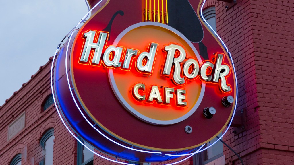
(UNITED STATES – NOVEMBER 21: Neon sign for Hard Rock Cafe in famous Beale Street entertainment district of Memphis, Tennessee, USA (Photo by Tim Graham/Getty Images))
The lettering “Hard Rock” features a custom type, which is both creative and legible. Below the lettering “Hard Rock,” you can see the word “Café” in white. It features a simpler sans serif font made up of capital letters.
How it put a “rock and roll” font, “Hard Rock” with a classic sans serif font, “CAFE” present its brand image perfectly. Without walking in the cafe, you can already image its interior design of covering its walls with rock and roll memorabilia.
