NO1. Poster of jet ski G1 All-Japan Champion (By Issei Nomura)
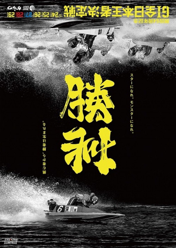
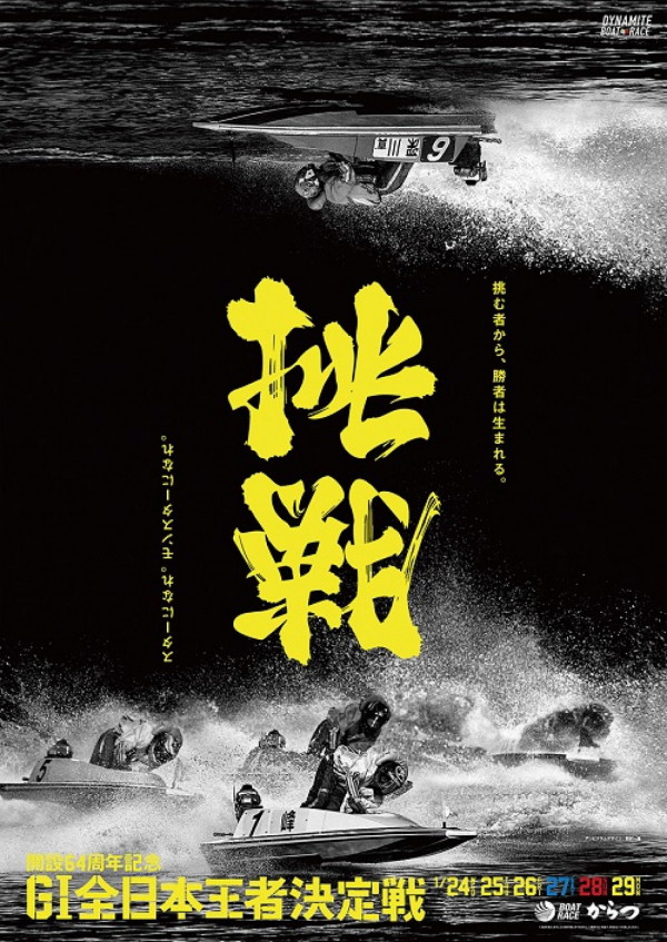
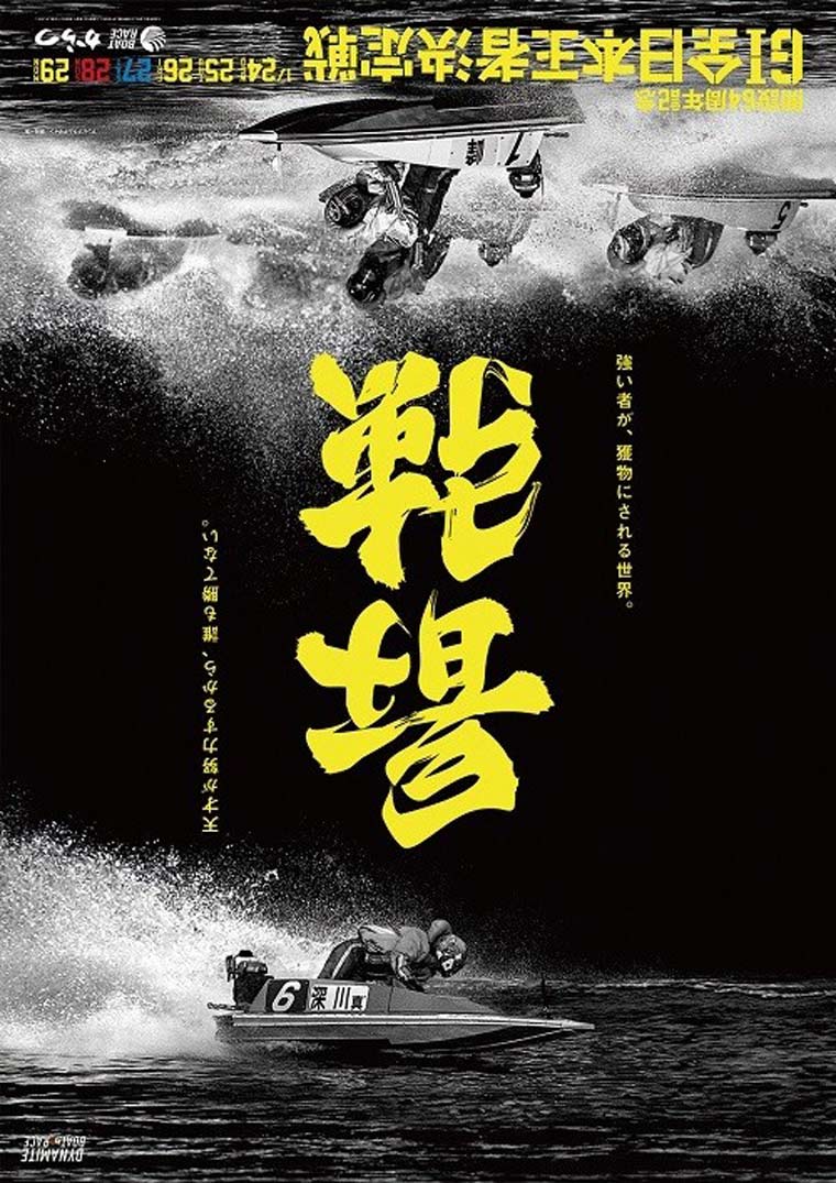
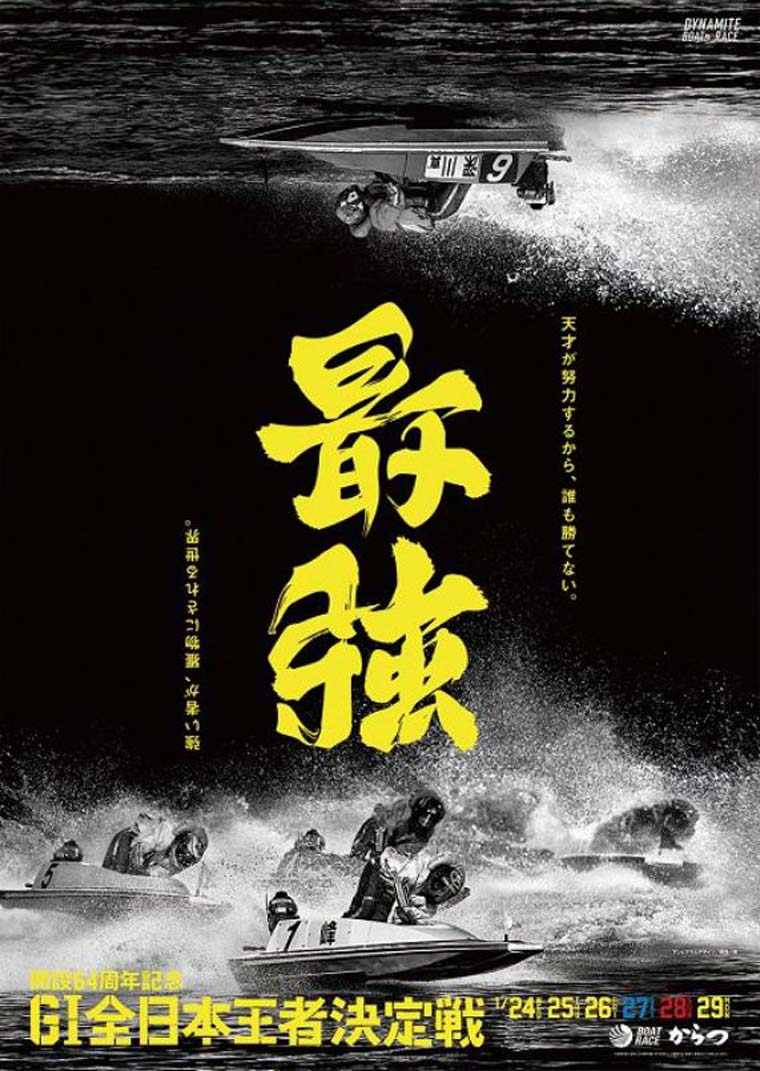
Issei Nomura use a calligraphy trick, in which a word or a phrase retains meaning when viewed or interpreted from two of more directions, or orientations. In these two posters , one can be interpreted from alternate directions as either “challenge (挑戰) ” or “strongest (最強),” while another can be read as “victory(勝利)” or ”battlefield (戰場).”
NO2. The traditional handwriting of Minibus Signs (by Mak Kam-sang)
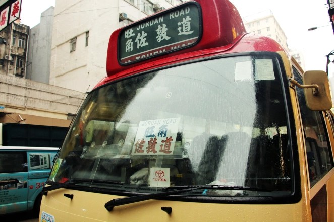
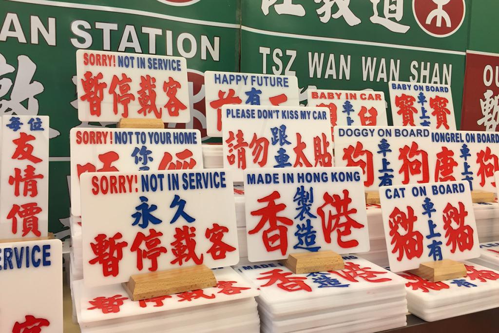
The traditional handwriting minibus sign is a unique feature of Hong Kong transportation system. Minibuses in Hong Kong have destination signs that are hand-written in Chinese characters. As the the last minibus sign writer in Hong Kong, Mak expanded his operation to novelty goods such as key rings and signs with slogans. I appreciate the authenticity and uniqueness of the minibus handwriting style in the product.
NO3. The Poster of ” Big Fish“
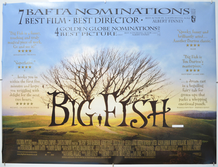
The typography on the poster matches its design and complements the film’s theme, creating a fantastical atmosphere. And so, it combine the letter with the picture.
NO4. The Poster of ” Terms and Conditions May Apply“
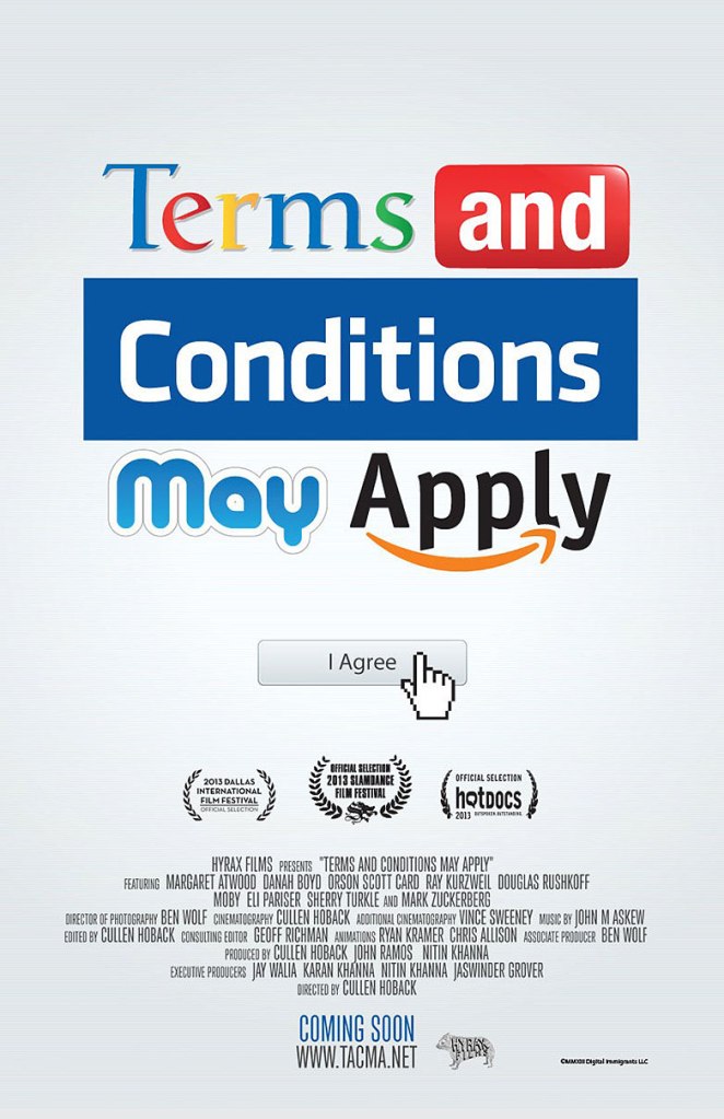
The typography on the poster for “Terms and Conditions May Apply” cleverly incorporates unique typography from various technology company logos, creating an eye-catching design that perfectly aligns with the film’s theme.
NO5. Freddie Mercury / The Big Issue (By Peter Strain)
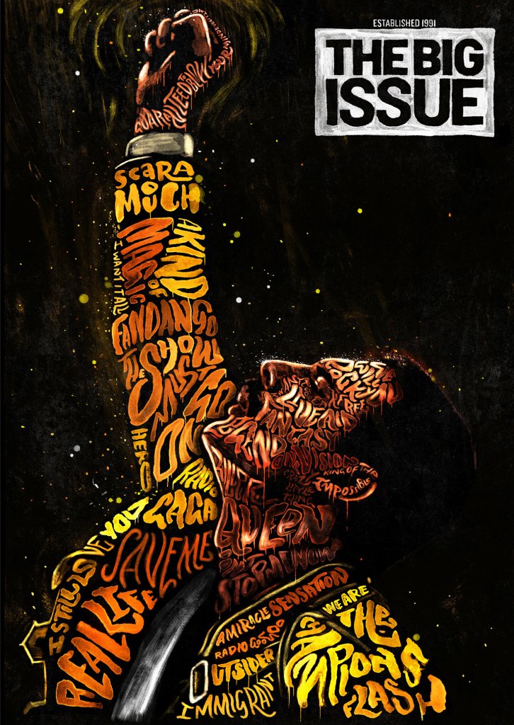
Peter Strain is an AOI (Association of Illustrators) Critics’ Choice Award-winning illustrator based in Belfast. He specializes in creating carefully composed, hand-rendered typography, animation, and illustration. In his work, you can clearly see that the poster picture is formed by different types and colors of letters.
