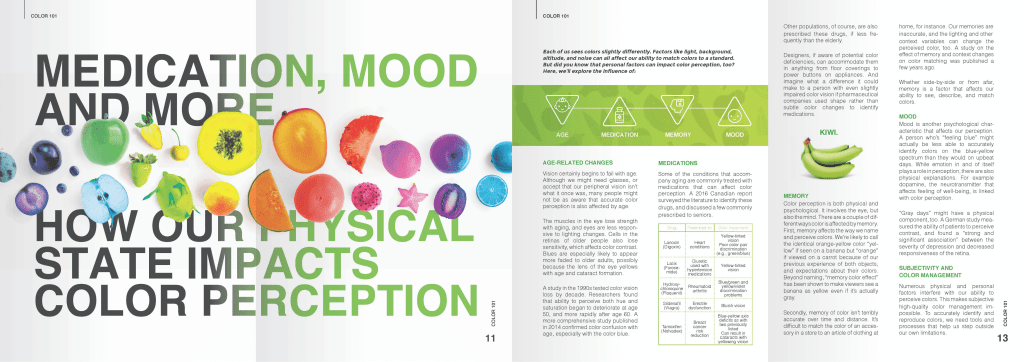
- This magazine explores the influence of our state on color perception. For the cover, a top-angle camera shot is employed to feature the fruit, which conceals a letter related to a featured topic. The photos are vividly presented, while the title remains attention-grabbing due to the color contrast between the background and the title itself. Furthermore, both the photos and the title are thematically linked. The typography is not only easy to read but also captivating.
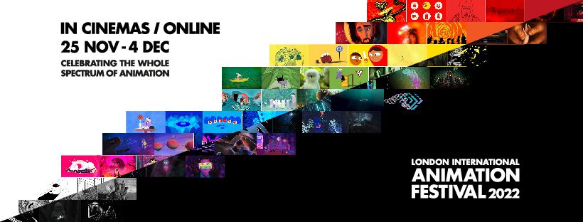
- This a post about animation festival. Letter spacing is proper to read. This post incorporate ample whitespace around text to improve readability. The white and black compared was strong to attract me to read these text. The interesting layout is to use pictures to create a high contrast diagonal lines.
- This is a poster for the Motion show. Blurred 3D patterns on both the front and back help emphasize the distinct outline of the title in the center. Despite the use of multiple fonts, they all share similar styles, creating an appealing yet cohesive look.
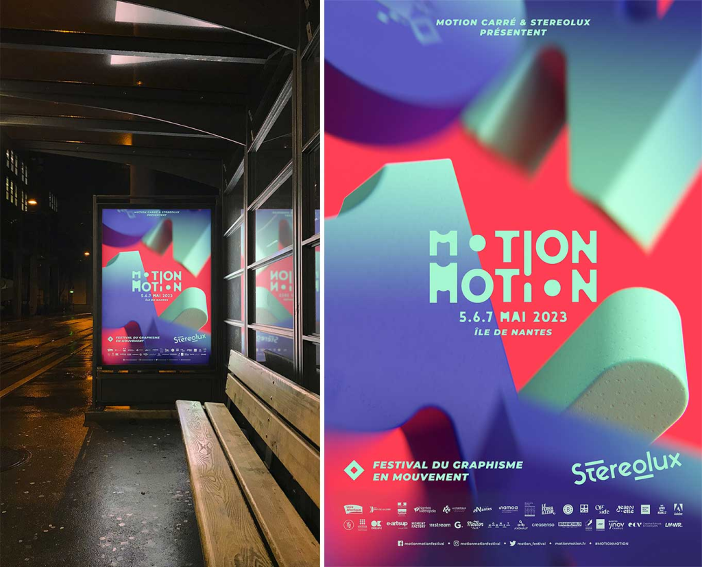
- This is a poster about Motion show. Blurred 3D patterns on the front and back can highlight the clear outline oThis is a poster for the Motion show. Blurred 3D patterns on both the front and back help to accentuate the clear outline of the title in the center. Despite the use of multiple fonts, they all possess similar styles, rendering them appealing without overwhelming.f the title in the middle. Although he uses multiple fonts, they all have similar styles, making them attractive without being too.
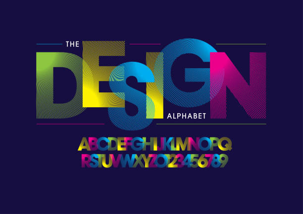
- Bold colors, overlapping, and dynamic, color-changing patterns create an appealing and prominent front. Vibrant text colors ensure clear readability, even when there is overlap.
