Is clean always best?
You might think the best design is always clean, shiny and simple. Often this is the case. In our tech culture, this style has come to symbolize a convenient, simplified life. Apple, Google, Audi and many other brands use this sleek style. Their products, packages and web sites we have come to equate with success.
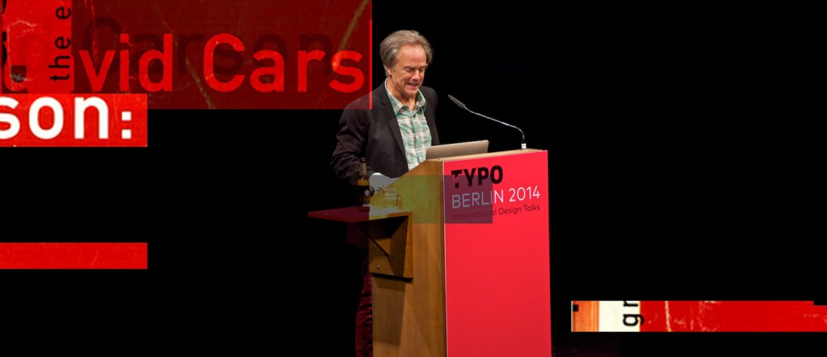
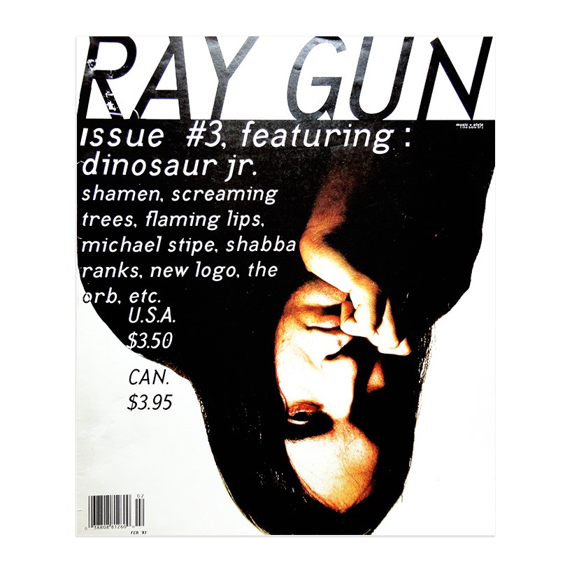
Given this, seeing David Carson’s graphic design work for the first time can be shocking. It is more shocking that he is one of the most influential graphic designers working today. His work generally seems so full of chaos.
Chaos Rules?
There are projects where this approach might work. “Deconstructed design” might be most appropriate for extreme sports, underground music and art. No absolute procedure exists to design this way.
Here then are some tips to help get your hands a little dirty.
1. Trust your intuition
How does the song look? How does the sport feel? Experiment, change, substitute. Throw away grids and guidelines and look for natural alignments in images. Go with those. Or try disrupting those alignments, if that tells the story better.
2. Know your audience
It’s always best to design for people you know well. Picture someone who’s into the subject of your design and ask what would they like to see. Carson comes from a surfing background and often designs for young extreme-sports enthusiasts.

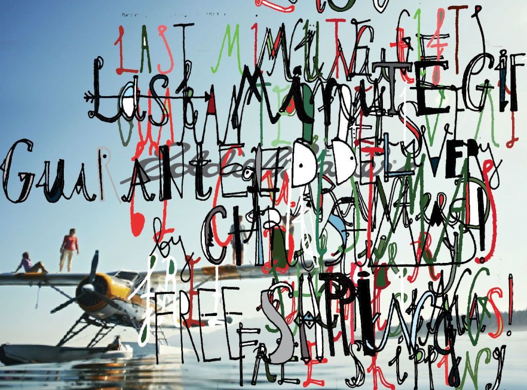
3. Use Emotional Typography
Understand emotions and use empathy to get at how the words will look and feel. You might need hand-lettering or you might need to alter a typeface. Show the emotion, rather than worrying about typographic readability. The reader will feel the message and then may take the time to decode the details.
